2.7 KiB
Why does the warning findDOMNode is deprecated sometimes appear in strict mode?
This is due to the implementation of @rc-component/trigger. @rc-component/trigger forces children to accept ref, otherwise it will fall back to findDOMNode, so children need to be native html tags. If not, you need to use React.forwardRef transparently passes ref to native html tags.
findDOMNode is deprecatedreproduce: https://codesandbox.io/p/sandbox/finddomnode-c5hy96- Using
forwardRefto fix: https://codesandbox.io/p/sandbox/no-finddomnode-warning-forked-gdxczs
Why is the tooltip for my custom component not opening?
Similar issues: #15909, #12812.
Please ensure that the child node to accept onMouseEnter, onMouseLeave, onPointerEnter, onPointerLeave, onFocus, and onClick events, If you create your own component and do not explicitly add these mouse and pointer events as props, the tooltip will never appear. See Example.
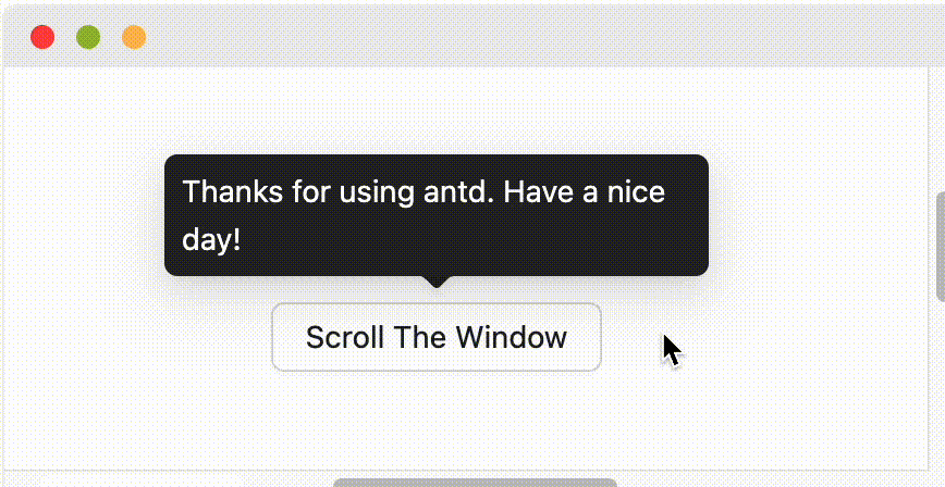
What's the placement logic?
It will follow placement config when screen has enough space. And flip when space is not enough (Such as top to bottom or topLeft to bottomLeft). Single direction such as top bottom left right will auto shift on the view:
When placement is set to edge align such as topLeft bottomRight, it will only do flip but not do shift.
How to support keyboard accessibility?
By default, Tooltip and similar components trigger on hover rather than focus, so they will not respond to keyboard focus events. If you want the component to support keyboard accessibility, you can enable it in the following ways:
- Enable for a single component: Set the
triggerproperty to includefocus, for exampletrigger="focus"ortrigger={['hover', 'focus']}. - Enable globally: Use
ConfigProviderto set global configuration, so all relevant components across your application support keyboard focus trigger by default.
import { ConfigProvider, Tooltip, Button } from 'antd';

// Single component
<Tooltip trigger={['hover', 'focus']} title="Title">
  <Button>Button</Button>
</Tooltip>

// Global configuration
<ConfigProvider
  tooltip={{ trigger: ['hover', 'focus'] }}
  popover={{ trigger: ['hover', 'focus'] }}
  popconfirm={{ trigger: ['hover', 'focus'] }}
>
  <App />
</ConfigProvider>